

Untying the Endless Knot
An exploration of Islamic geometric patterns through four objects

Recently, I visited the Metropolitan Museum and finally saw the galleries for Islamic art. Although I’ve been to the museum many times, somehow I’ve never made it to this corner. Being chronically online, I had watched the YouTube video on the construction of the Moroccan Court when the Islamic art wing was renovated but hadn’t thought much of it beyond a general appreciation for their effort in bringing in artisans to create an authentic space showcasing living artistic traditions. My appreciation deepened about a year ago, when I took a dive into Islamic geometric patterns and tried my hand at creating them, mostly following the guidance of Eric Bourg and Jay Bonner.1 As a result, when I finally visited the Moroccan Court at The Met, armed with newfound knowledge and enthusiasm, I noticed a blunder in their new construction, discovered two works that illustrate the techniques and subtleties in the craft, and even spotted a piece that at first glance seemed like a mistake, but ultimately revealed the importance of keeping the tradition alive.
How not to make Islamic geometric patterns
Before I delved into the methods of construction and studied various examples, Islamic geometric patterns were, to me, one of those things that evoke a fond but vague impression yet impossible to recreate (not unlike a double-story “g”). The appeal is easy to understand. These designs combine translational (a section of a design can be repeated to fill the plane) and point symmetries (complex star- or flower-like patterns clustered around various foci). They feature interlocking and interlacing lines that suggest an infinitely continuing weave, as if executed by a meticulous yet imaginative artisan who know precisely where to bend and twist the threads to surprise you at every turn. Moreover, these patterns are often developed into colorful and innovative compositions. There is a dazzling variety of forms realized in different materials, and take on different characters, whether as multicolored tiles on floors and walls, reliefs carved on stone facades, lattice screen windows, metal inlays, or minute paintings on manuscript pages.
Despite the variety, a few conventions are generally observed. Skilled artists, of course, break these rules to create novel patterns or to address specific contextual demands. However, disregarding them haphazardly risks producing designs that appear incoherent and amateurish. Here I will attempt to bring out the essentials.
The first few rules all serve to maintain the impression that the designs are formed by interweaving lines that either extend infinitely or connect into loops. First, lines should never terminate except at the boundary of the entire design. In practice, inexperienced artists often break this rule by allowing lines to end at an intersection, creating a T-shaped junction. Second, lines must maintain their direction before and after crossing another line. In other words, lines should not change direction at an intersection point. This issue commonly arises when a designer copy elements from existing pieces that do not fit align properly due to mismatched orientations or incompatible angles. They may attempt to fill in the gaps by improvising connective tissues but end up losing the tussle against geometry. Third, within a single design, lines should only turn or intersect at a limited set of compatible angles. These angles are usually derived from a basic “seed” angle by taking the compliment of an angle, doubling, occasionally halving, or adding angles together. This guarantees that any pair of line segments will either be parallel or form a few fixed angles, ensuring a harmonious geometric relationship and an orderly aesthetic.


The second set of rules addresses the framing and scaling of geometric patterns. The complexity of a pattern should suit the size of the surface that it covers. Intricate designs should not be used on small areas, nor should large areas be tiled with simple patterns. The latter is a more common problem in modern attempts. Another convention is that when a design features large star-like elements, the border of the design should align with the centers of these stars, with the corners of the canvas also coinciding with the centers of the stars. This ensures that even incomplete elements at the edges and corners retain as much rotational symmetry as possible, avoiding distorted or asymmetric shapes that only appear along the boundary.


Interestingly, when artists untrained in the methods of constructing Islamic geometric patterns make the mistakes mentioned above, it often stems from a very common failure mode. Typically, they recognize that these repeating patterns can be generated by tiling a small unit. Consequently, they search for an existing design they like, cut out a portion, and fill their canvas with it. However, the tile they choose may not correspond to the actual repeating unit, resulting in awkward seams where lines that don’t belong together join up at sharp angles and form undesirable shapes. Even when the tiles are selected correctly, the designer might fail to fit the region precisely with them. If the tiles exceed the area, the patterns are cut off mid-design, leaving the piece looking incomplete. Conversely, if the tiles fall short of the boundaries, the artist is forced to fill in the gaps. Without knowledge of construction methods or and understanding of the constraints outlined earlier, they often extend the patterns in ways that produce incorrect joints, asymmetric shapes, or awkward bends.
Beyond adhering to straightforward rules, an experienced artist makes nuanced decisions that require careful judgment. They aim to balance the visual rhythm of complexity and simplicity within the design to create focus and sustain interest. They also determine the coloring and stylization of patterns, incorporate local traditions, and craft multiple designs for adjacent surfaces to achieve a varied but cohesive ensemble.
In case you haven’t figure it out yet, the examples of missteps mentioned above are all from The Metropolitan Museum. I noticed them in two pieces during my recent visit: a set of doors in the (somewhat) recently constructed Patti Cadby Birch Court, designed to emulate a Moroccan courtyard, and a set of ceiling panels overlooking Ottoman carpets and armors in Gallery 459.

I suspect that the making of the door in Moroccan Court involved precisely the kind of copy-and-paste error described earlier. The artist likely found a pattern they thought suited the context and scaled it to fit the height of the door panel2. However, they either neglected to ensure that the design filled the space horizontally or decided to extend the pattern by one petal-width on each side for better proportions. In either case, relying on the regularity of the pattern, they attempted to mirror and extend it locally to create the necessary edge elements. Unfortunately, without a proper understanding of the rules governing Islamic geometric patterns, this approach led to lines terminating at T-junctions, distorted figures near the edges, and ad-hoc asymmetric shapes.
Ironically, the pattern used by the Met artist appears on the cover of Eric Broug’s Best Practice in Islamic Geometric Design, the very book from which I summarized the basic rules of line arrangement, symmetry, and scaling! To arrive at the design on the door, the artist may have rotated the pattern 90 degrees, repeated it four times, and added extra — often incorrect — lines up to the border. I can’t help but wonder if the woodworking artist felt out of their depth when they embarked on the project. Tasked to build something that would harmonize with the new Moroccan Court, in a style they were unfamiliar with, they might have skimmed Broug’s book to grasp the key elements of the style. Perhaps they found the cover image appealing enough to incorporate it into their work but ultimately failed to absorb the lessons Broug was trying to teach. That said, given the apparent popularity of this design (here's an example; Jay Bonner cites a few more in relation to his Fig. 320b), it’s also possible that the artist was working from an isolated finished panel and simply lacked the knowledge or resources to adapt the design appropriately.

The ceiling decorations from which I drew the other examples are far more intriguing, even though the errors were more severe and noticeable. Their age was apparent, so unlike a modern imitation, I was initially hesitant to attribute them to inexperience or ignorance. Upon further research, an interesting provenance emerged. The ceiling panels originated from post-Reconquista Spain and had been expanded beyond the original design. It is possible that the original author — whether Muslim or Christian — was skilled enough to produce a correct design or replicate a common pattern from their milieu. However, a later artisan, likely untrained in geometric design, may have relied on cruder imitation and imagination, leading to the clear blunders. According to The Met, these panels are “a testament to the resilience and persistence of traditional Islamic design in Andalusia after the Christian Reconquista.” This is true. The preservation and expansion of these panels show that their patrons valued the design, even though it came from a foreign tradition. Nevertheless, the fragility of craft traditions is evident in these errors, highlighting skills that become starkly visible only in their absence. These unseen skills risk being irrevocably lost if there is a break in the chain of inheritance.
I mention unseen skills, but interestingly, there is another piece of artwork at The Met that allows us to see the main method of constructing Islamic geometric patterns.
How to make Islamic geometric patterns
I have criticized the wrong methods — copy-and-paste and ad-hoc imitation or invention — for making Islamic geometric patterns and their unfortunate effects. And even copying depends on the original invention of patterns, which presumably used the proper techniques. So what are the proper techniques?
Serendipitously, this is illustrated explicitly in the following jali, or perforated stone screen from the Mughal empire, also on display at The Metropolitan Museum.

Notice that this screen actually breaks one of the key rules listed in the first section —there are numerous three-branch junctions. Setting that aside for the moment, a closer look reveals two distinct types of lines in the design. The first is slightly thicker and protrudes higher, while the second is thinner and slightly recessed, extending and weaving in a (mostly) typical fashion3. The rule-breaking is partly justified by the jali’s material and function. Viewed from indoors against sunlight, the openwork window would appear as a web of shadows. The fine details needed to create an interlacing effect are difficult to discern under such conditions and could weaken the stone structurally. Therefore, the artist is justified in omitting interlacing altogether. Without interlacing, the “no T-junction” rule need not be strictly enforced, except for aesthetic purposes. Additional lines that create T-junctions may be added as long as they accord with the overall design. The thick protruding lines in the jali play this role. A keen observer will also notice that these thick lines enclose three polygonal shapes that tile the area, as illustrated below. This turns out to be a hint at how most Islamic geometric patterns are constructed.


Now let’s reintroduce the thin pattern lines. Within the boundaries of each polygon, the most noticeable shapes are probably the five-pointed stars in each pentagon. A closer look will reveal pairs of larger five-pointed stars inscribed in the decagons as well — one pointing upward and the other downward. These highly symmetric geometric figures make the design visually fun to look at. However, I want to draw attention to fact that all these shapes share the same vertex angle of 36 degrees, with their vertices positioned at the midpoints of the edges of the polygons. This applies even to the hexagons, which contain pairs of swift shapes rather than stars. Thus zooming in on the edges, we see two pattern lines pass through the midpoint of each edge, forming a fixed angle of 72 degrees with it. As a result, when any pair of these polygonal tiles are lined up edge-to-edge, the pattern lines within one tile will intersect on the edge and continue seamlessly, without bending or breaking, into the neighboring tile.

Now we have a method of construction. Begin with a set of polygonal tiles that can tile the plane. Choose a seed angle. From the midpoint of each edge of every tile, draw symmetric pattern lines. These lines must be symmetric around the midpoint and form the chosen angle. When a pattern line originating from one edge intersects a pattern line from a neighboring edge, terminate both lines so that they form a single, continuous line. This line will appear to enters the tile at the midpoint of one edge, turn in a new direction, and exits through the midpoint of another edge. Finally, tile the plane with these completed polygonal tiles. As if by magic, the pattern lines will connect into an Islamic geometric pattern that perfectly adheres to the rules of line arrangement prescribed earlier.

This pattern is based on one set of polygonal tiles and a specific arrangement of them. There are many families of such tiles, helpfully classified by Bonner according to the order of rotational symmetry of the largest regular polygon in the set. Additionally, there are numerous ways to fill the plane with these tiles (some examples of regular polygonal tilings can be found here). Given a set of polygonal tiles, various — but not arbitrary — seed angles can be chosen. The choices tiling and seed angles have the strongest influence on the resulting pattern. An experienced artist can intuitively select the appropriate tiling scheme and seed angle to suit to their intentions without needing to plot out the entire design. While the process described so far may seem systematic and rigid, there are also non-systematic aspects that greatly increase the variety.
For example, observant readers may have noticed that the pattern lines in the decagonal tile don’t strictly follow from the method described so far. To achieve the nested star shape, the pattern lines emanating from the edges are extended until they intersect with a second line. This adjustment enhances visual appeal in the largest and most prominent tile in the design. It also balances the density of pattern lines, preventing a large open space from appearing in the center of the decagons.
The special treatment of high-symmetry points is far from the only variation. I will only summarize a few additional techniques to hopefully convince you of the endless possibilities. A major caveat is that there are non-systematic designs that do not originate from polygonal tilings. These typically begin by deciding on the order of symmetry (i.e. the number of identical “petals”) of the most elaborate star element. Radial lines are then drawn from the centers of the stars to determine the placement of other irregular polygonal tiles, which are subsequently filled with pattern lines. The top half of the double door in the Moroccan Court, featuring a large central element with 40-fold symmetry, was likely constructed using this approach.


Additionally, pattern lines can be developed in ornamental styles. We have already seen two common strategies. In the ceiling and the door designs from The Met, the lines are interlacing (more subtly in the latter case). This technique uses shadowing, coloring, carving, or orientation of material texture to imply that one line passes above the other at intersections. In the finished work, each line alternates between weaving over and under. The jali pattern, on the other hand, exemplifies another common technique, where pattern lines are widened and sometimes augmented with borders or internal decorations, which can be geometric or floral. Borders and decorations can also be incorporated into interlacing designs, as seen in the ceiling design. A completely strategy eliminate explicits lines altogether, instead coloring the areas enclosed by line segments. This results in an intricate tiling pattern of alternating obtuse polygons and stars, often enhanced by subtle variations in the texture of the material used for the tiling.
Even when an artist chooses not to be bold with novel tilings or line patterns, it is still possible to create new and interesting designs by remixing existing patterns or introducing geometric elements that might ordinarily seem incongruous. This approach is beautifully exemplified by the wall panels in the Moroccan Court.


In the “making-of” video created by The Met (linked earlier), they explained their intention to adapt a design from the Alhambra to suit the Moroccan context they aimed to create. The design process was challenging, and the experienced craftsmen ultimately responsible for building the panels were deeply involved. The curator described it as a medieval ordeal, involving cutting and pasting figures traced on paper with scissors, and even plotting directly on the walls, as the designs were too complex and constrained for computer design software to handle effectively. I would argue that this approach was precisely the correct one. Through this collaborative and iterative process, the specialist craftsmen were able to teach the art historians about geometric constraints and practical know-how that the latter could not have anticipated.


Cutting and pasting designs is generally challenging to execute well, but in this case, they did a stellar job. The original Alhambran design was dominated by stars with 16-fold symmetry (which I refer to as daisies), lining the edges and alternating with another type of star in the middle row. The Met’s adaptation incorporates more square-tipped stars (which I call zinnias). Substituting one star for the other is not particularly difficult in this case, because both stars are the same size and the outer edges of the dark tiles in both have identical vertex angles of 135 degrees, allowing them to fit interchangeably with the surrounding polygons. The difference between the stars become apparent further inward. The zinnias feature double lines in each petal, creating cross shapes that emphasize the vertical, horizontal, and 45 degree axes. This visually reinforces the square-based placement of daisies within the overall design. More subtley, the zinnias have lower symmetry than the daisies. While they sacrifice the 16-fold rotational symmetry for an 8-fold one, this tradeoff allows the colored tiles in the zinnias to echo the shapes in the tilted square regions located at the midpoints between the daisies, especially since the artist set them in similar colors.
In the process, this design actually violates two of the rules I quoted earlier. Within the zinnias, the outer lines in the double-lined petals have 90 degree bends that (almost) land on intersections with lines connecting to the inner petals. This is excusable because the zinnias are non-standard shapes with more bends and intersections and is dominated by white color, meaning the viewer’s attention is less likely to be drawn to any discordant detail in the white areas. The other suspended rule involves the placement of stars on the edge. In both the Met’s and the Alhambran designs the centers of the edge stars are positioned slightly inwards from the exact edge of the panel. While I have previously explained the general issue with this choice, in this case, I find the adapted design more clever and more harmonious. The zinnia’s emphasis on squares and 90 degree angles means its components appear less incomplete when you they are cut off-center. Moreover, as noted earlier, the zinnia’s starker angles make it connect more naturally to horizontal or vertical patterns. Thus, when placed on the edge, the petals blend seamlessly into the implied bounding strip, adding and extra layer of depth to the design.
Conclusion
I am usually not one to pontificate about art history or living traditions, especially not about an artform I knew almost nothing about just a year ago. However, I have always been fascinated by decorative arts, possibly due to my exposure to the beauty of symmetry through my academic background in math and physics. One thing I’ve realized through that exposure though, is that the symmetry group of an intricate geometric pattern only scratches the surface of its full beauty. Most people would agree that there are at least additional aesthetic elements at play in these designs, such as the choice of a palette or the rhythm of lines and shapes. However, it turns out there is literally more than meets the eye. While the patterns appear to consist of twisting and weaving lines, they are built from small, plain, and invisible tilings. Most people would struggle to construct an Islamic geometric design themselves and may not even realize the depth of skill they are lacking. Immersed in a living tradition is often required overcome the Dunning-Kruger.4
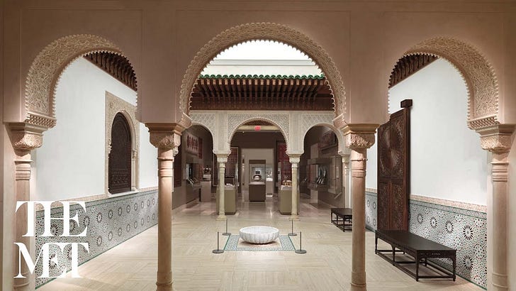
The blunders and triumphs in The Met’s collection illustrate this point. The Moroccan Court is intended as a magical space. Visitors steps through lacy pink stucco arches into a lively courtyard, complete with a gentally bubbling fountain and vibrant wall panels. The colorful designs carve out flower-like patterns in dark tones, evoking an airy, shaded retreat just beyond the walls. There are no explanatory signs for each object — you are meant to experience them on immediate, non-verbal terms. After you pass through through, an interactive screen (which was out of order during my visit) provides information about the building of the Moroccan Court.
At the center of one wall stands a set of large wooden double doors, perhaps inspired by the entrance to a study in a madrasa in Fez. Being in an art museum, you wouldn’t attempt to open them, knowing better than to touch the artwork. But it is clear in any case that these doors don’t lead anywhere, and at that moment, you see through the illusion. You probably won’t even notice the flaw in the geometric pattern on the doors, but I think it hints at why the illusion ultimately falls short.
Museums often create spaces similar to the Moroccan Court in their galleries. Most often they consist of an array of furniture and decorative objects from a particular period and region, arranged to approximate a bedroom, drawing room, or study. Visitors are encouraged to the objects individually, aided by laminated diagrams naming each piece along with its origin and date. Walking through such a gallery, you are invited immerse yourself in the atmosphere, but the display remains largely informative and functional. There are insterstitial objects that may initially seem authentic, but visitors are unlikely to feel disappointed upon learning otherwise, as the authenticity of the space is secondary to the authenticity of the objects. The setting simply illustrates where a card table might be placed and how vases and statuettes would be arranged on the mantel. There is no need to believe that someone once lived here, where every detail was planned according to their taste and needs.
Alternatively, the museum might reconstruct or relocate an entire room, using original objects in their original positions. In this case, the room itself becomes fully authentic, and visitors are encouraged to take it in as a whole. The Met’s Damascus Room is in fact such a space — a genuine and complete slice of late Ottoman Syria relocated to New York. Standing at the threshold (you are fenced out of the room by acrylic barriers, as the floor tiles are part of the exhibit), you admire it from a respectful distance, but are nevertheless invited into an experience that feels wholly foreign in space and time.
The Moroccan Court is similar to the Damascus Room in that you are asked to believe you are somewhere else. However, unlike the Damascus Room, the Moroccan Court does not exist. There is no specific Moroccan Court being recreated here, and the space is functionally a hallway connecting galleries, with glass display cases visible on either side. The logic of a true courtyard does not actually apply here — there can’t realistically be a study on the other side of the heavy double doors, the stuccoed arches don’t need to blend with similarly ornate walls, and the floor isn’t tiled in the same color scheme as the lower walls. The Met seeks to capture a living, thriving artistic tradition in this space and claims to have done so, but it doesn’t quite succeed. It is neither a true spacetime capsule, like the Damascus Room, nor a typical immersive gallery. Instead, it is an amalgam of creations from that tradition, attempting to convince you of the authenticity of the space through a sleight of hand.
Still, I think there is another story to be told here. Instead of a triumphant story of continuation, there is a quieter story of loss — a story that intertwines mathematical precision, inherited craft, and continous innovation. I hope I have conveyed it well. Perhaps this thread that will continue.
My knowledge of Islamic geometric patterns mainly came from Jay Bonner and Craig Kaplan’s Islamic Geometric Patterns: Their Historical Development and Traditional Methods of Construction. This tome is incredibly rich in examples and explanations of the technique. It even goes beyond the traditional designs and envision infinitely self-similar designs and designs based on tilings of the sphere. It is sure to entertain a math nerd. The other author from whom I learned and borrowed is Eric Broug. He has written multiple books introducing the aesthetics and construction methods of these designs to the general public, aand gave detailed instructions on compass-and-straight-edge constructions for some especially compelling patterns.
Strictly speaking the height of the pattern is not scaled ideally either. There is half-a-petal too much pattern on both the top and bottom. As a result the 12-pointed gear-like shapes at the middle of the stars at the top and bottom center are distorted. My guess is that this choice is influenced by the treatment of borders in the wall panel design right next to the door. The wall panel design should be thought of as a compromize. More on this later.
Except for the flower-like figure at the center of the ten-pointed star figures. This breaks the T-junction rule, but I consider it permissible for two reasons. First, the design already juxtaposes polygonal tiles with pattern lines, and the former contains many more T-junctions. At least the decagonal flowers gels with the rest of the design. Second, on a stone screen, the artist might actually prefer to have these extra ornamentation to stabilize the the structure of deeply perforated stone. Additionally, a window screen should perhaps have more evenly sized holes, to prevent glare or excessive shadow.
Well, to be fair, I learned from books, and their authors learned from examples and instructional manuscripts. Still, what this shows is more that it is possible to revive an artistic tradition (not that this particular one is actually dead). In the end it still takes doing the actual work of designing and building to gain the know-how.